Product design case study
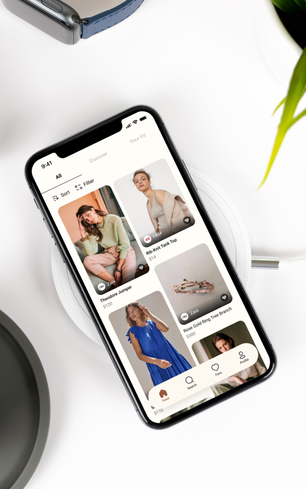
EZ-Shop is a mobile app for online shoppers that I created as part of the BrainStation UX Bootcamp. It provides users with an easy way of choosing fashion items based on their style, size, and other preferences. The Ultimate goal of this project is to help users choose what they need confidently and reduce the number of returns.
Problem Space
The popularity of online shopping can be summarised in a
single word: Convenience
Purchasing products from the comfort of our own home is quicker and easier than visiting a brick-and-mortar store.
But today’s high rate of returns is a big challenge for online
shoppers because it takes up valuable time and energy. For this project, I wanted to explore this topic because it is something I struggle with personally. I wanted to find a solution that helps to decrease the chance of returns. To gain a better understanding of the problem space, I used secondary and primary research methods.
Secondary research
What are the challenges people face today? Through my secondary research, here are some reasons for returning online purchases according to online shoppers worldwide:
- Wrong size
- Poor quality
- Not as described
- Ordered more than one of an item
- No longer wanted the item
- Faulty or damaged
Since this problem space was too general I dug deeper and I found out
-
Millennials are the #1 online shoppers, making up 60% of all online clothing sales
-
56% of returned online products fall into clothing/shoe category
-
88% of fashion shoppers return 51% of online fashion items purchased online
Based on these new findings I decided to focus my project on fashion-related items instead of the space of online shopping in general and tackle the problem for millennial online shoppers as potential target users.
User interview insights
To learn more about the common pain points, behaviors, and motivations of my potential users, I talked to 3 millennials.
Size and quality
They suffer from inconsistent sizing and quality of items in online shopping
Trusted brands
They usually visit their trustworthy websites or brands to browse and purchase a product
Marketing tricks
Marketing tricks has a big role in buying unnecessary products which are often returned.
Time and energy
They strongly dislike the return/refund process, because of the extra effort and time they need to put to return an item
From the interviews, I learned that providing a digital solution that provides millennial online shoppers with results that are tailored to them, will help them confidently choose items and reduce the chance of return.
Persona &
Experience map
From the interview insights, I was able to get a better sense of the millennials’ experience. I built a persona and experience map based on this research in order to drive my designs for the target users and identify opportunities in which to focus my digital solution.

Persona &
Experience map
/Persona

Christine
37
Montreal, CA
Graphic Designer
About
Christine is a kind and compassionate person and she has a lot of tight-knit friends. She is a mom and a wife, but also a big art nerd. She frequently does online shopping and that ranges from clothing to household items. She is a very caring person and loves to make others happy. She purchases gifts for her friends and family online. Also, she sometimes shops on a whim on her phone.
Pain points & Frustrations
- She gets overwhelmed because she can’t decide on items to buy
- She returns things because of inconsistent size or poor quality
- She will be pulled by the marketing gurus to try things she knows that will never wear and those things would most definitely be returned
- She finds returning an item is annoying, tedious, and kind of unnecessary
Opportunities
- Provide her by recommendations based on her preferences
- Help her find the right item to buy online without feeling frustrated of browsing too many options
Motivations & Goals
- Due to convenience and safety during Covid, she prefers online shopping
- She tends to only order from places she can return in person
- To buy an item she will choose the most common websites that she would buy that item from
- She likes to set her shopping preferences and see fewer items based on them when searching online
- She wants to make sure that she buys things she will use and not being wasteful
Behaviours & Personality
- She wavers between being sort of impulsive and thoughtful while shopping online
- She sometimes adds many items to the cart and then never check out
- She orders a bunch of things that she doesn’t need and then return them
- She uses different shopping apps at least a few times a week
- She shops for her kids online
I think I’m at the age now where I kind of figured out the clothes that I wear frequently, and so I tend to buy similar items to either update or upgrade my wardrobe. But often I’ll be sidetracked and I’ll be pulled by the marketing gurus to try things that I know that I will never wear. And then those things would most definitely be returned.
Persona &
Experience map
/Experience Map
Keeping users and their experience at the center of my design, I asked myself this question:
How might we provide millennial online fashion shoppers to find the right products
based off their individual needs in order to help
them make more confident shopping decisions
and reduce the volume of returns?
Task Selection
Looking back at the key opportunities in my Experience map, I defined the core functionality and features of my digital solution by developing a series of user stories that actually speak to my persona needs, goals, and frustrations. Then I categorized them into Epics based on their similarity.
Taking into consideration the core value proposition, I chose the following epic and user stories to create my minimum viable product (MVP).
Core Value Proposition
Provide online shoppers with recommendations that are tailored to them
Core Epic
Personalized profile
Task Selection
/User Stories
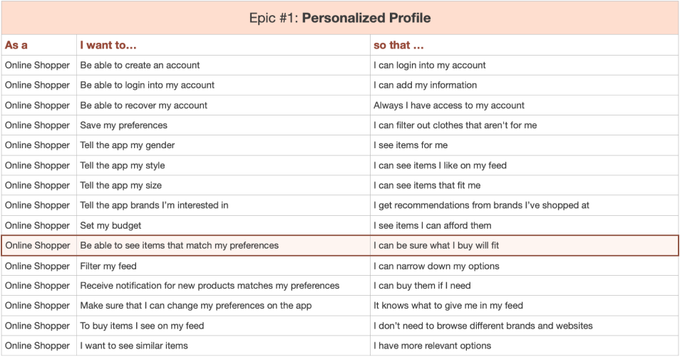
This table is showing 15 user stories under “Personalized Profile” epic. The highlighted one is the main task I considered for MVP.
I created user stories in the format As a [user role], I want [action], so that [benefit].
Task Selection
/Task Flow
After identifying the main tasks, I developed a task flow by visualizing the sequence of steps that a user will take while engaging with my digital product to complete these tasks.
This task flow shows a user sets up preferences on the app to see a customized feed.

Sketching & Wireframing
/Sketches
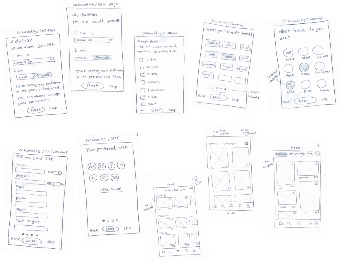
Keeping my main task flow in mind, I started sketching out various ideas using inspiration from other existing UI components and looking at apps like Shop, Pinterest, Depop, ASOS, and Instagram marketplace.
Sketching & Wireframing
/Wireframes
I turned those sketches into a digital wireframe and created a mid-fidelity, black-and-white prototype to test with different users. This is the first version of my wireframes.

Usability Test
Testing and iteration is the most important part of the design process.
To understand users and discover the best experience through iterations, I did 2 rounds of user testing with 5 participants in each round.
In each round of tests, a set of tasks were assigned to the testers.
From the feedback I received through testing sessions, design changes were made to the prototype.
Impacts
Notable Changes
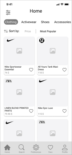
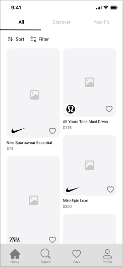
“ Early iterations of the product did not consider IA and proper hierarchy for filters. The filter icon that includes subcategories was on top of the categories, which translated into users not understanding how to use filters. I redesigned the filters and included all categories and subcategories in the filters. Instead of categories, I added “Discover” and “Your Fit” tabs for easy access to new products and what fits the user. ”
Testers were confused about what is included in preferences on the tab bar. They expected to see settings for the app. I moved all user preferences to the profile now users can edit their preferences in the profile.
“ I changed the card layout to a masonry layout to be able to use different sizes of images on the feed. I moved the brand logo to the bottom for more symmetry and a clean card design. ”
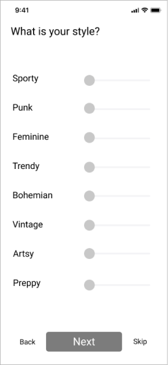
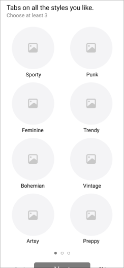
Testers mentioned they don’t know different styles. I added imagery to choose the style type instead of the slider which was difficult for users to use. And I asked the user to choose at least 3 styles for more personalized recommendations on the feed.
Moodboard
Color &
Typography
/Color
Using these inspirations from my moodboard, I created a color palette that reflected these words.
Since I’m going to have a lot of photography to work with from brands that I can not control, I used a subtle and neutral color palette.
I used the minimum possible number of colors to ensure that the user will not be distracted by colors and be able to focus on the product images.
#FFFDF8
Primary
#97593E
Accent
#F3EBE8
Complimentary A
#FFFFFF
Complimentary B
Color &
Typography
/Typography
For typography, I used Roboto because it is a simple and neutral font that evoked the same feeling, also legible and clean on screens with many images.
I checked accessibility standards for chosen colors to ensure that my design is accessible.
Logo
Discovery
The main goal of my app is to provide users with an easy way to choose items they will like and that will fit them when they shop online.
I decided to name the app EZ-Shop which is the combination of two words “Easy” and “Shop” to reflects the idea of easy shopping. With that in mind, I started sketching my wordmark.
Exploring &
Assembly
Exploring different typefaces to find a proper one for my idea, I found “Futura” a solid, simple, and easy-to-change font. I tried to implement my idea with minimum changes to the font. First I started with changing “O” to looks like a shopping bag then I realized I need to change it a lot. The second option was “H” which is more looks like a shopping bag. So I used the white space on the top and by adding the handle and after some iteration, I came up with this simple wordmark
Hi-Fi
Prototype
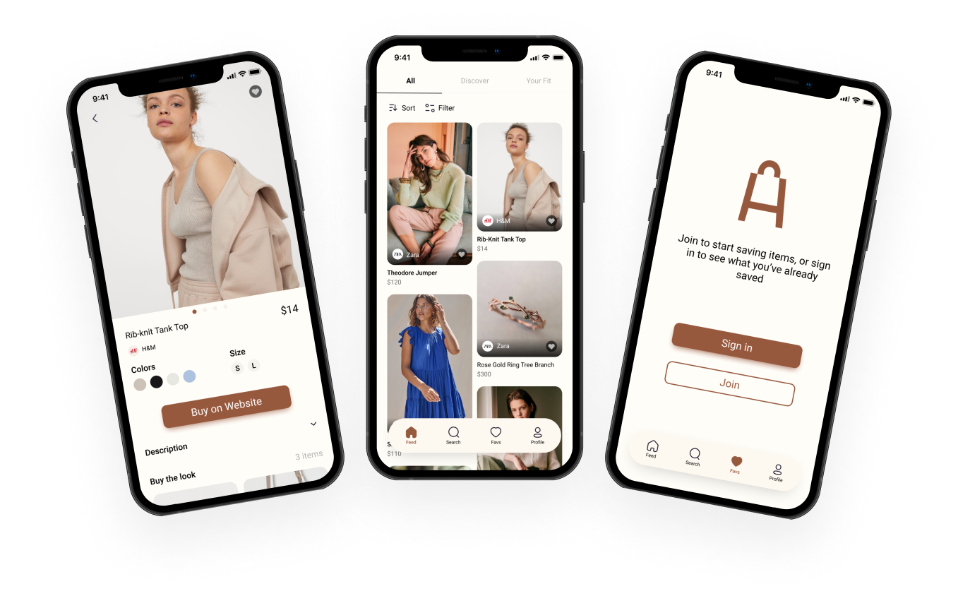
Putting it all together,
I created my final UI design. To see the interactive prototype please click on the button below.
Marketing
Website
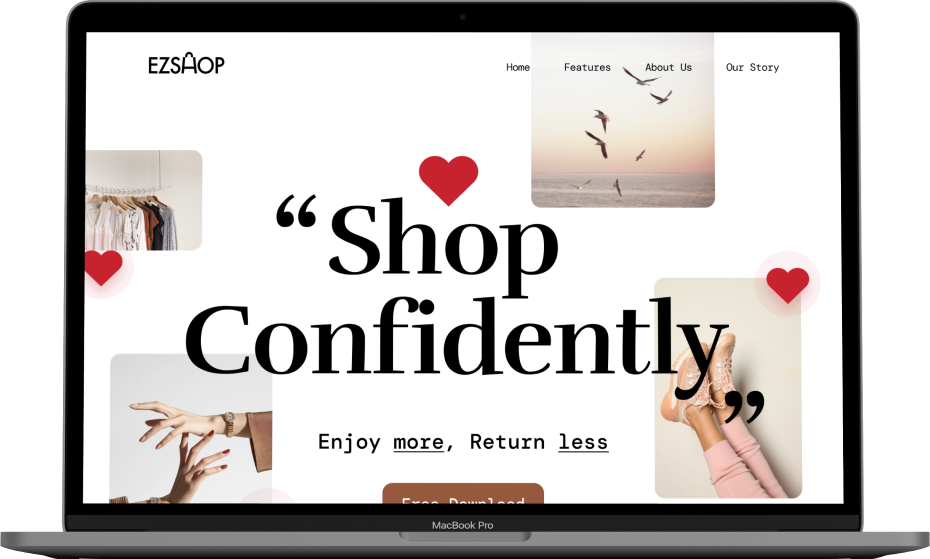
In order to provide an overview of what my product is capable of, developing the marketing website was essential to launch the product.
It allows users to find out about the features and how the product would be a good fit for what they are looking for.
The marketing website builds anticipation and can generate leads from my potential customers. This website can also increase user engagement with my app.
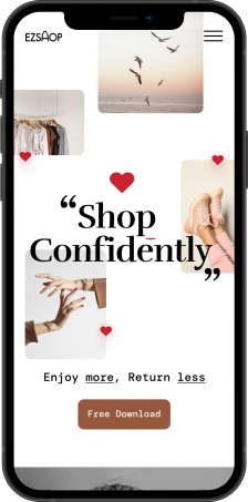
Following responsive website design best practices, I ensured that the site is responsive to all screen sizes.
What’s Next?
A lot of improvements can still be made to EZ-Shop. Some of them are as follow:
-
 Include reviews, ratings, and photos from customers on the product page to help shopper choose the right product.
-
Considering other solutions for measurements such as adding a selection of sizes in tops and bottoms or visual like body types.
-
Include other preferences to be more robust and personal like fit, colors, or types of clothing the user wears most commonly.
Key Project Learning
This project thought me that everything does not need to be perfect from the start and I shouldn’t block myself to find the best solution. As I moved forward and tested the app and applied feedback from users and peers, I clearly saw a lot of improvement in my solution. The whole design process is all about iteration, iteration, and iteration…
Another valuable takeaway from the project is about designing for the user. In all steps of the design process considering users and the goal they need to achieve is a key to success. Each time I had a hard time deciding which path to take I just took a step back and reviewed my user needs and goals, and I found the answer.