Patient First
Improving Healthcare
Timeline 3 Weeks
Tools Figma | InVision | Pen & Paper | Zoom
My Role UX Researcher | UX Designer | UI Designer
Platform iOS
Project Overview
Patients First is a government led initiative aimed at improving healthcare for patients. The initiative aims to place people and patients at the center of healthcare by more deeply understanding patient needs and experiences, while improving patient outcomes. For this project I’v been asked to Learn about patient experiences with the healthcare system and discover opportunities for design intervention. This project helped me to have a better understanding of the importance of qualitative and quantitative research.
Research & Discovery
According to data from Health Quality Ontario In June 2019, patients spent an average of 16.3 hours waiting in emergency rooms! Canadians reports the longest wait of patients in 11 countries
%
Reported waiting 7+ days to see a Family Doctor
%
Reported waiting 4+ hours to see a Emergency Department
%
Reported waiting 4+ weeks to see a Specialist
Problem Space
My research shows, waiting for care in emergency rooms has been and continues to be a major issue for the healthcare sector in Canada. This issue will cause patients some frustration and dissatisfaction. In this project I want to explore this space in more detail to develop a better understanding of the issues surrounding emergency rooms services in order to develop a solution to improve patient experience.
Assumptions
Based on research findings, I formed a list of assumptions before starting my qualitative research. These assumptions helped me narrow down my research direction and develop a precise questionnaire later on.
- ER waits in Canada are beyond excessive
- Patients hate waiting but there are no alternatives
- Patients easily feel distress when it comes to their health
Primary Research
Research Methods

User Interviews

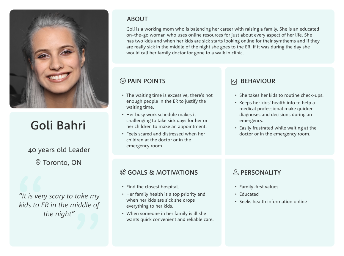
Persona
Usability Testing
User Interviews
I conducted primary research in the form of decontextualized user interviews. Interviews help capture insights into patient frustrations, pain points, and goals. The purpose is to ask general and specific questions in order to explore solution directions and opportunities. General questions help open up the conversation, while specific questions help build a deeper understanding of patient’s hopes, fears, wants. For this research I talked to 3 person who lives in Canada.
Methods & Tools
- Qualitative Research
- Virtual interviews via video calls
- Recording if permitted
Criteria
- 25-60 Years old
- Male / Female
- Has experienced ER in Canada within the last year
Goal
- Understanding patient experience with existing healthcare services
- Learn about their pain points and challenges, and behaviours
Interview Summary
I gathered data from interviews and organized by themes and patterns. I grouped notes by pain-points, motivations, or behaviours. This helps to analyze findings and identify themes. I later pulled out key insights from themes.
I waited such a long time. It was 5 in evening and I was in the hospital until 4am
We were distressed because we had to wait long time to get the final result. My aunt was so upset and frustrated
One time I was in the ER during the day and it was crowded
I had an experience in Toronto too and that is three hours of waiting in the emergency waiting room
They didn’t give us much information. That was the most frustrating part
we waited for a long time for my mom to get care. I think because it was really busy
One physician was responsible during the night
We were there for 8 hours. I had the same experience with ER before. Never left the ER earlier than 5 hours
A bit of a better bedside manner from the doctors and the nurses
I would love to have some idea how long would wait until the next, what they would do next, how long we have to wait in between, those updates
More transparency would be nice in terms of priorities, if they do it based on the level of emergency or something
They could give us an answer to why he was feeling like he was feeling
My mom was really sick so we called 911 and she was taken to the ER
If it was during the day we would hold our family doctor for gone to a walk in clinic
I was there before, its clean hospital with good service. I was familiar with the place, but I think if I google it this is the nearest one to our place

How might we help patients experience less wait time at ER so that their frustration and distress are lowered?
HMW
Persona
From the interview insights, I was able to get a better sense of the experience. With this research, I crafted a persona and in order to drive my designs for the target users and identify opportunties in which to focus my digital solution.
User Stories
Considering the needs of Goli the persona, I created a set of user stories under 3 epics in order to help me define the function of my product. Taking into consideration the core value proposition, I chose the following epic and user stories to create my minimum viable product (MVP).
Core Epic: Searching for urgent medical care
- As a patient, I want to search for ER based on my location, so that I can see list of ERs in my area
- As a patient, I want to see list of different ER, so that I can scan through options
- As a patient, I want to see estimated waiting time for different ERs, so that I can scan through options with detail
- As a patient, I want to find a nearby ERs, so that I can find the fastest access to care
As a patient, I want to know the waiting times of the ERs in my area, so that I go to the one with less waiting time
- As a patient, I want to see number of patients in the waiting list for each ER, so that I know how long I would wait
- As a patient, I want to search for specific ER by name, so that I can find the one I know or previously recommended to me
- As a patient, I want to see different ERs on the map, so that I can easily find the nearest
- As a patient, I want to know if a ER don’t offer emergency medical care. so that I don’t wast my time going there
- As a patient, I want to be informed if there is no internet connection, so that I have access to latest updated information
- As a patient, I want to learn how to use the app through an onboarding, so that I know how to use it when I need it in emergency situations
Task Flow
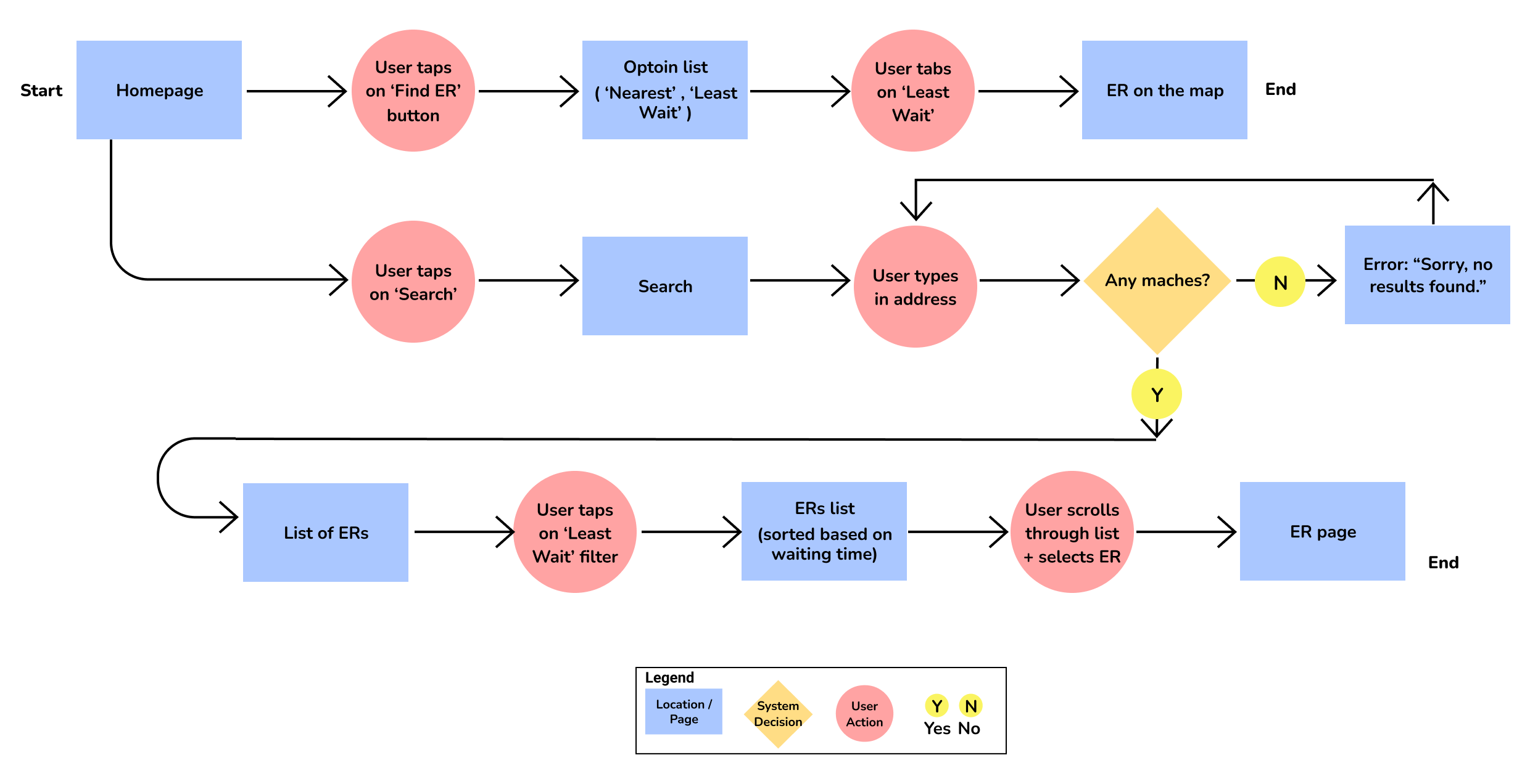
The core flow of the application was searching for urgent medical care. I decided to go with a simplified task flow of the process for efficiency. For this project I had a constraint of exploring only one task flow.
User Story:
As a patient, I want to find medical facility with minimum estimated waiting time so I can have access to medical care in less time.
Task:
Searching for ER
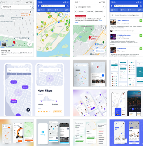
UI Inspiration
To get an idea of how to design this app, I started with checking different location-based app to see different possible page layouts and what the user expects to see.
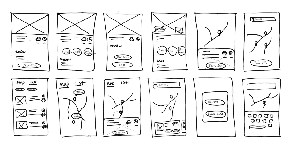
Sketches
After viewing inspiration, I sketched out a few variations of different features I could build on the app. Once I had a number of variations available, I wireframed the most promising options.
Initial Wireframes
After selecting the most compelling sketches I translated them into wireframes that will create the groundwork to get to the prototyping phase
Usability Test
After constructing my first prototype, I took it out for a test drive. I ran two rounds of user testing, getting feedback from a total of 10 users each round 5 different users.
First Round
This table shows the overall testing results of first round of usability test
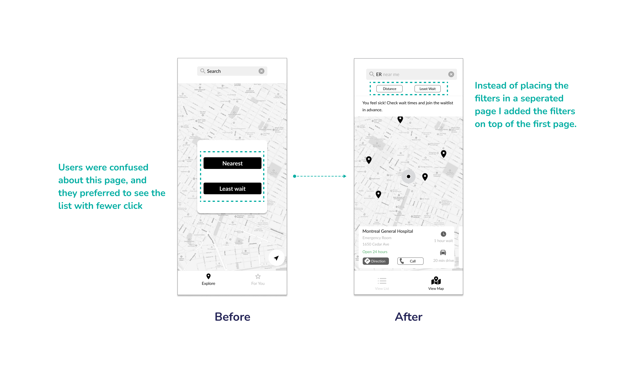
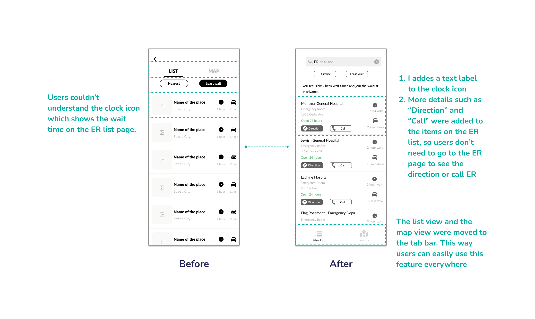
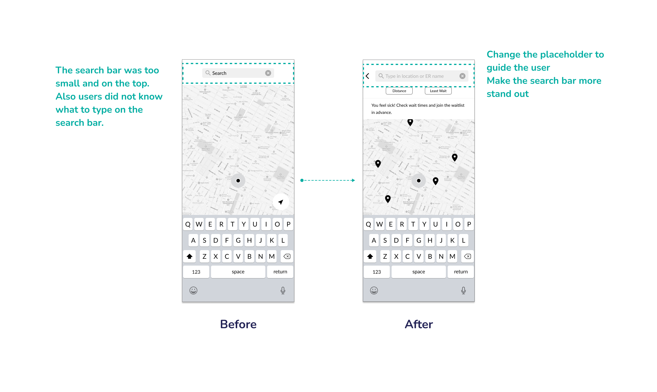
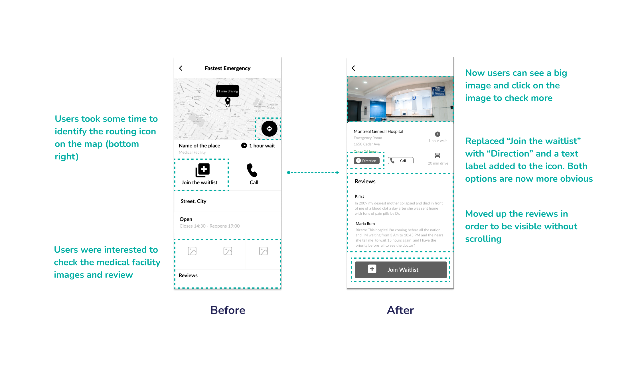
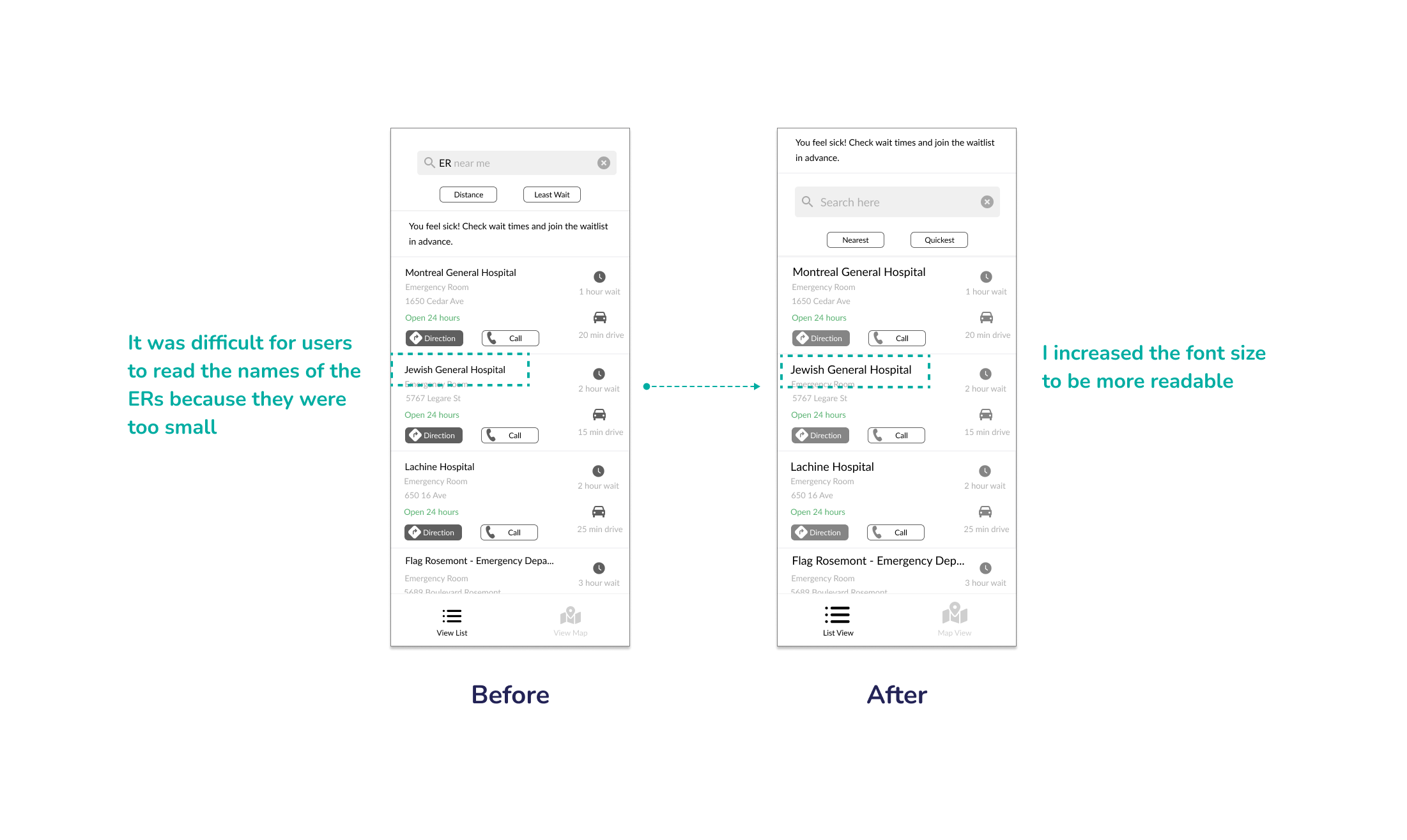
Based on the feedback from the first round of user testing, these are the main changes that I considered for the next version:
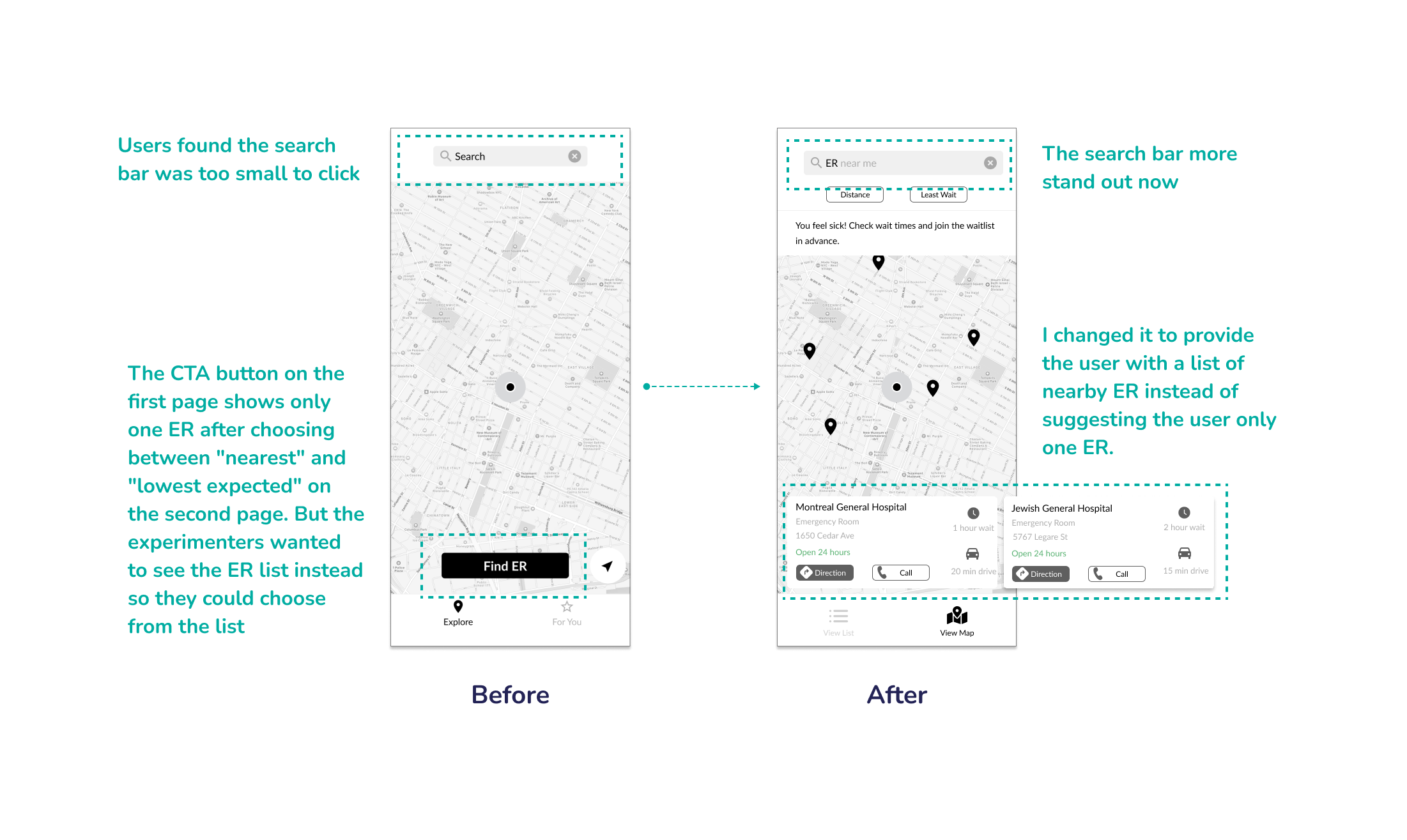
- Change the search bar placeholder in the first screen
- Make the search bar more stand out
- Use label for the clock icon in the ER list
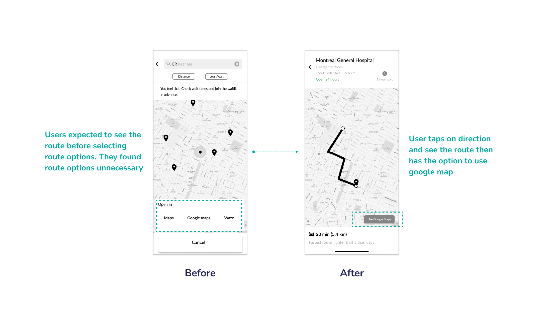
- Change the “Direction” button
- Add list of ER in the first screen
- Move the List view and Map view to the tab bar
From the feedback I received in testing Round 1, design changes were made to the prototype. I took the next iteration of wireframes to Round 2 of usability testing and continued to iterate.
Second Round
This table shows the overall testing results of second round of usability test
Feedback from the second round of user testing that I considered for the next version are as follow:
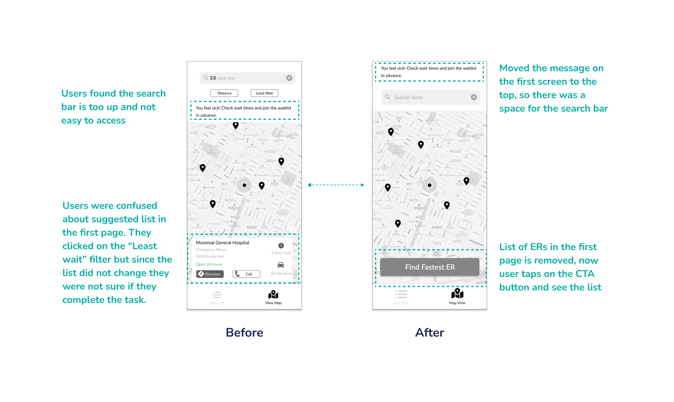
- Changing the first screen to have a CTA button
- Moving the message on the first screen to the top
- Using only one filter (Fastest) instead of two filters would be better to keep the flow simple for the user
- Remove the suggested hospital on the first screen
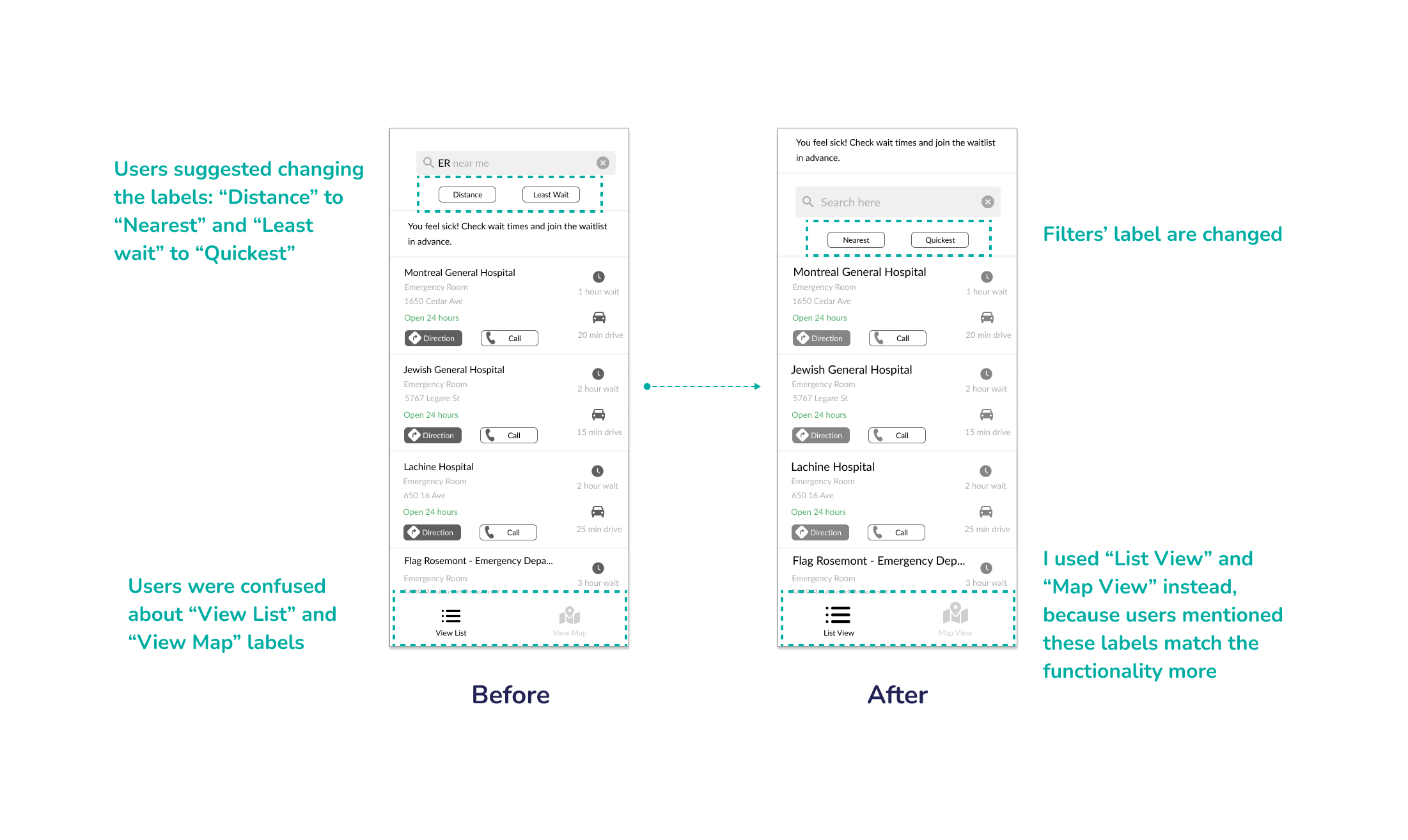
- Change the tab bar items’ label
Final Prototype
Here is the final wireflow after two rounds of usability testing:
